Danny Payne is a photographer who is mostly know for band photography and live event photography.
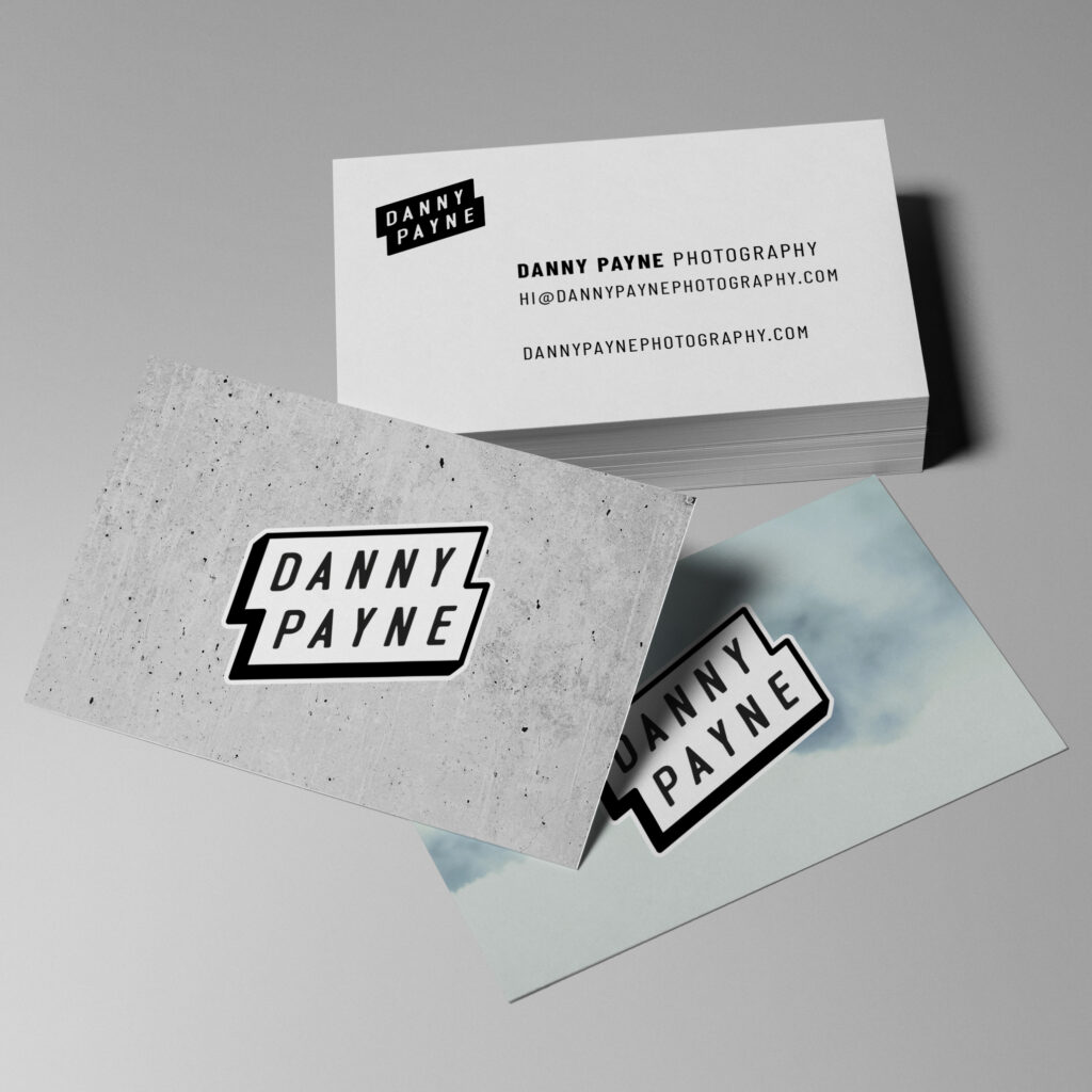
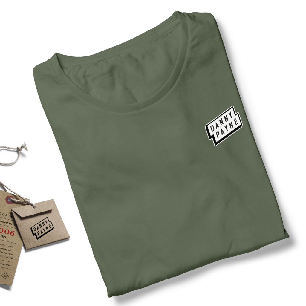
Danny came to me for a brand re-design. He felt his old logo no longer reflected him and his work. He wanted something with more personality, feeling and impact but maintaining an air of professionalism that sits perfectly with his photography.
The original brief was to develop logo options based on hand drawn typography, I explored bold scripts, brush lettering and tall uppercase lettering. After showing some options it was clear that Danny preferred a cleaner look and we decided on using a display font I created (Pronk).
I wanted his logo to really fit with the band scene and early on i wanted the logo to resemble a sticker you might find on a guitar case or flight case. From my hand drawn explorations I designed a banner style logo, this was influenced by those bands stickers. This concept works well with Danny’s photography and also acts as a great sign-off watermark on his images.