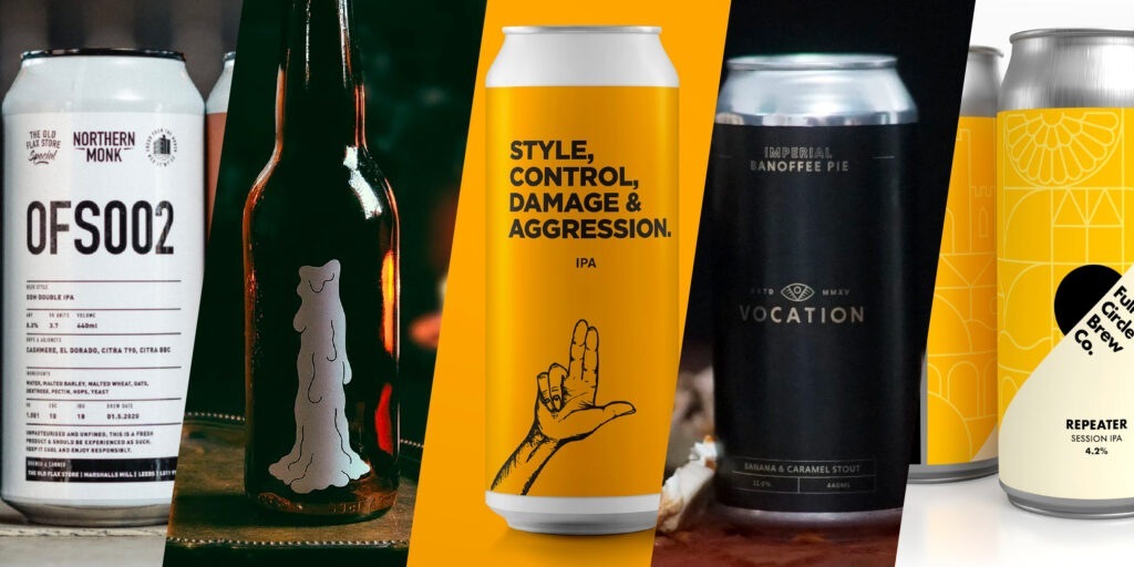
Here are 5 of, in my opinion, the best beer label designs I have seen over the past year.
The beer branding game has evolved extremely quickly with more and more craft and small breweries popping up. Competition on the shelves has sparked an exciting and really refreshing set of trends in the beer scene.
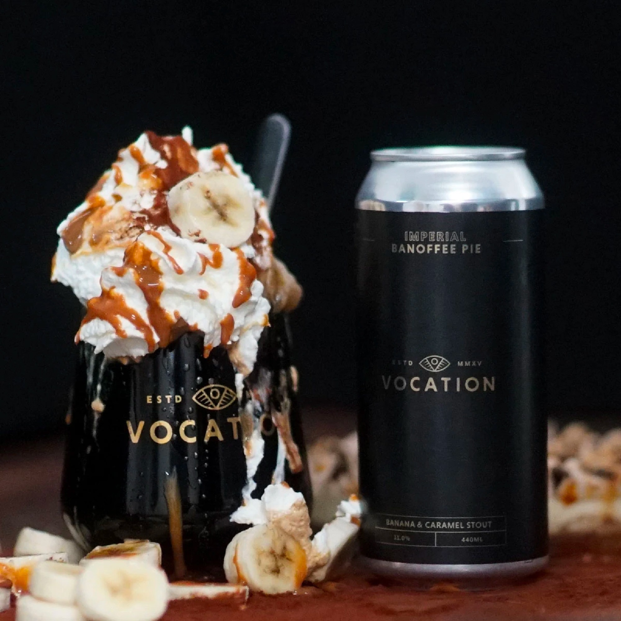
Vocation – Imperial Banoffee Pie Stout
I had this beer over Christmas, what a treat! The dark label with a super subtle texture and gold lettering describes exactly what is going on inside the can – A dark, rich, thick stout with an 11% kick. Awesome beer and can design.
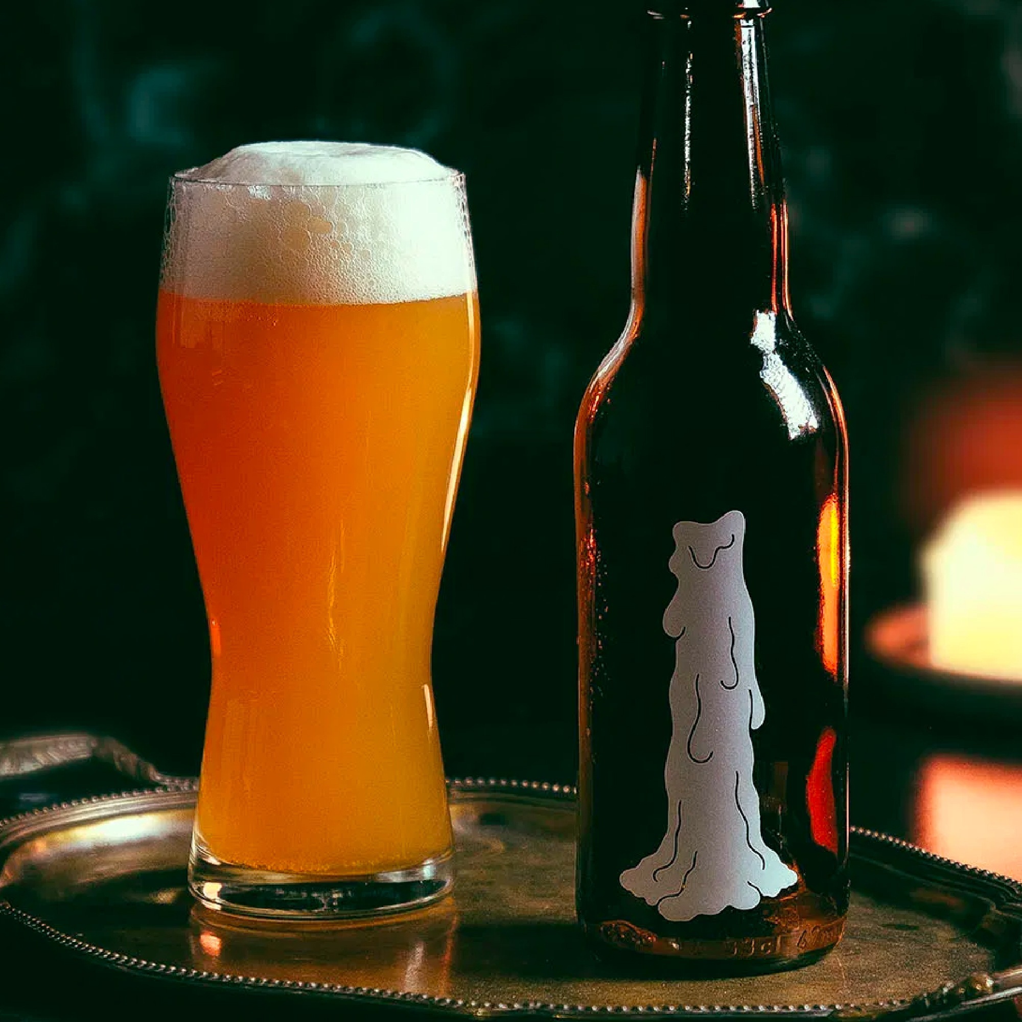
Omnipollo – Maz
Bottle artwork is by Karl Grandin who has produced many of the Omnipollo bottle and can artworks. Although this design has been around for a years I felt it still needed a mention.
I love the bold, minimal approach which totally breaks conventions of what we expect to see on the front of a beer bottle. When seeing this bottle on the shelf, I was instantly drawn to it to find out what type of beer was inside.
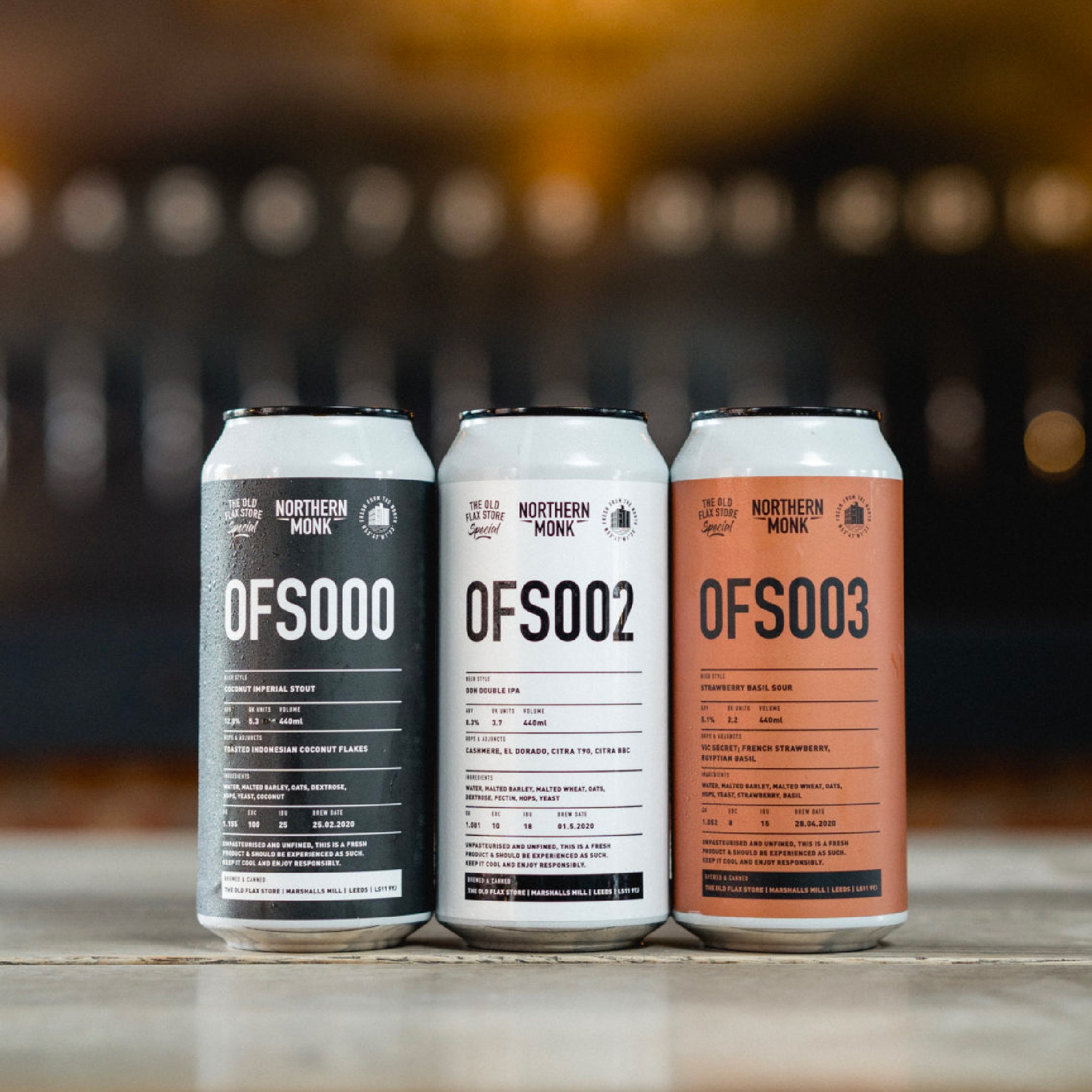
Northern Monk – OFS (The Old Flax Store Projects)
The OFS can labels are great, they are simply a well-designed spec sheet, even the beers are only known by code numbers, no fancy names here. The OFS projects are all about the exploration of beer and using ingredients from around the world.
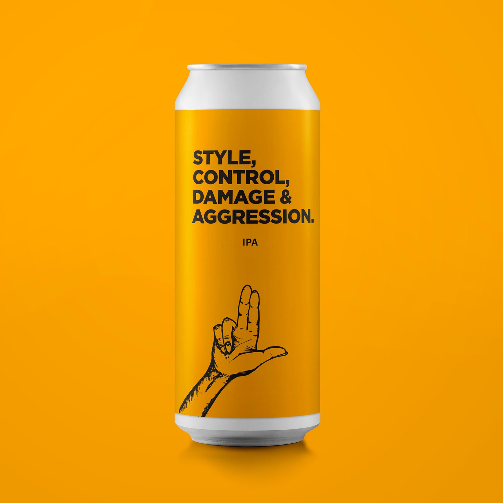
Pomona Island – STYLE, CONTROL, DAMAGE & AGGRESSION IPA
Pomona Island does nothing but simple and bold can design, their entire range follows the same formula; solid ground colour, 1 colour graphic, large name and smaller beer style. On it’s own it’s a striking design, when you have a collection they are pretty epic. I also love the name, this took me right back to being a kid watching Robot Wars.
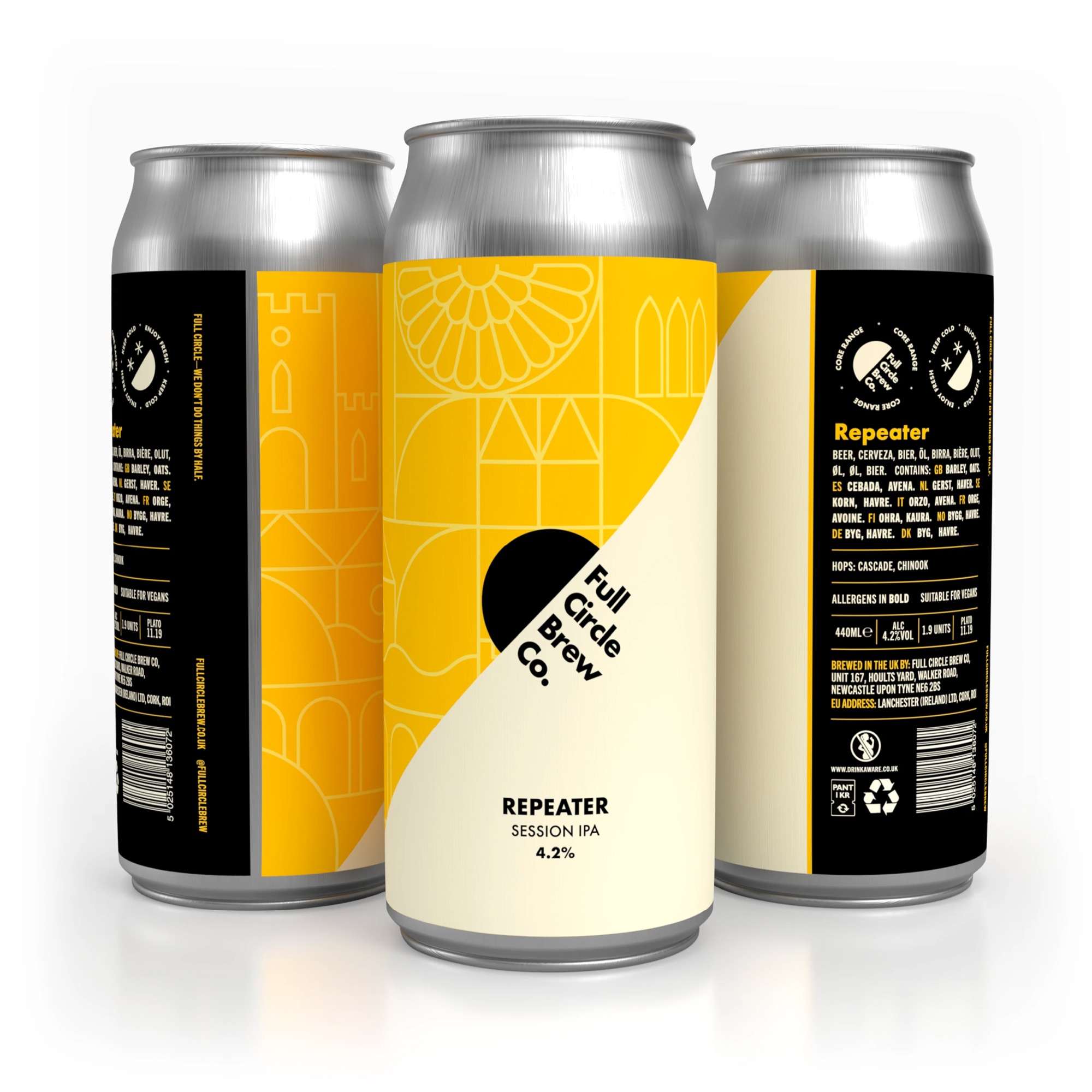
Full Circle Brew Co. – Repeater, Session IPA
This is the standout design for me, it’s bold, different and really modern. I was instantly drawn to it because it screamed of a brewery who fully trusted the thoughts and vision of the design agency they commissioned. From the logo to the label system, it’s all-round great and visually jumps off the shelf.
From a print and design geek perspective the Full Circle can labels have some nice touches. The matte stock with spot UV gives a visual depth with a hint gloss. When you handle the can, the mix matte and gloss details give an interesting and memorable fell.