Beer Brand Identity for Craft Beer Exchange Keighley
Tags: #Logo
Beer Brand Identity for The Craft Beer Exchange in Keighley
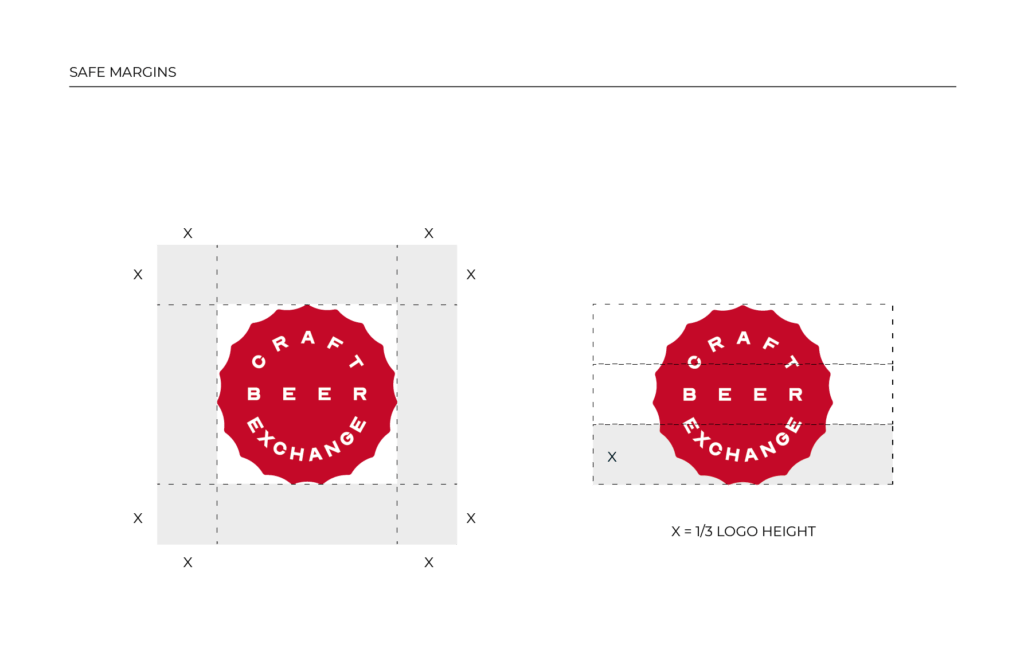
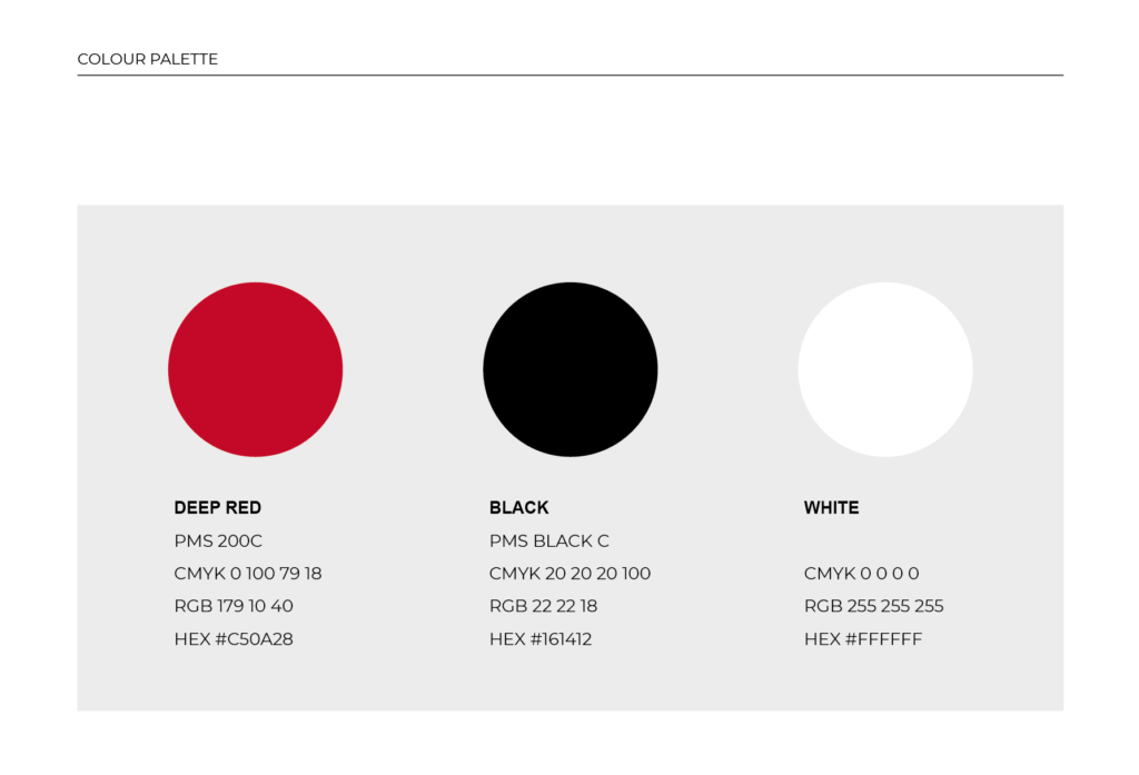
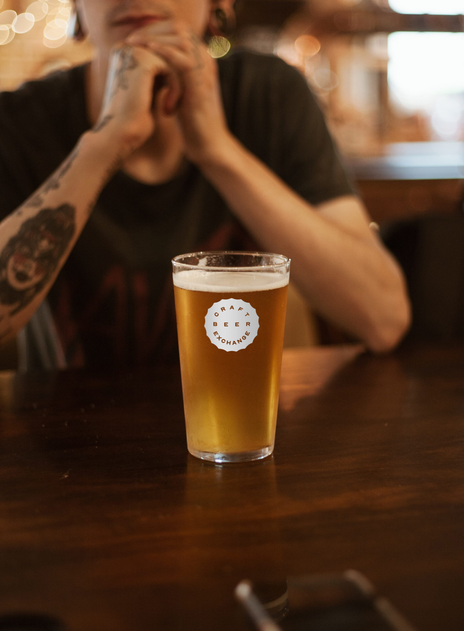
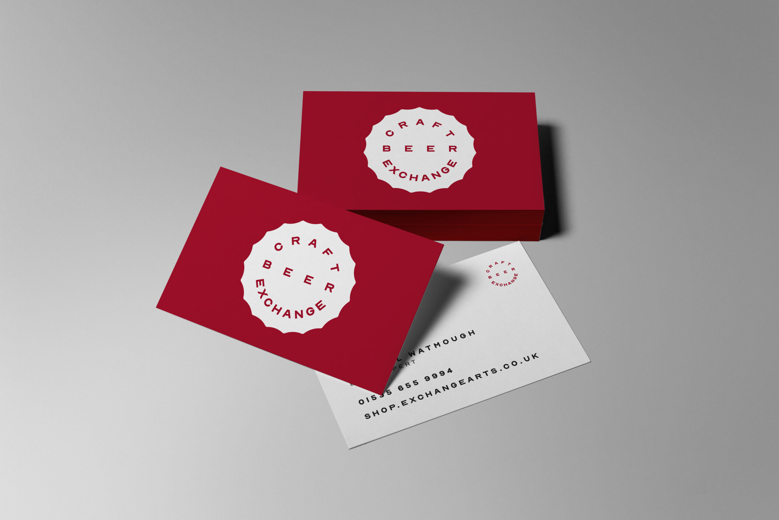
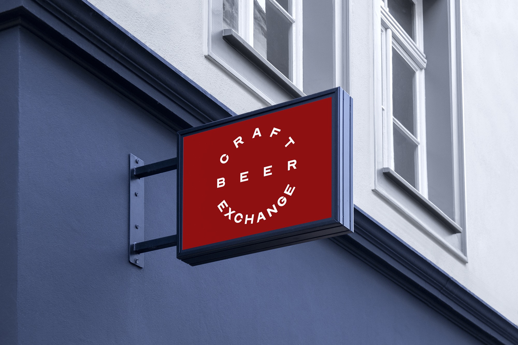
Taking a clean and simple approach I based the framing shape on a top-down view of a beer bottle top. The typeface is strong and geometric to create a solid lockup.
Early on, we decided that the logo should be able to be used as a badge, sticker, stamp or beer mat. Having this kind of versatility means CBE can use the logo in a number of creative ways across their packaging, advertising and merch.