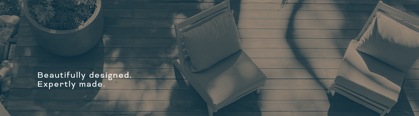
My good friends Matt and Ben Pedley have started their landscaping and garden design business (pedleylandscape.co.uk). Not only are they two of the nicest people you are likely to meet, but their work is always well designed, well-considered and extremely well finished.
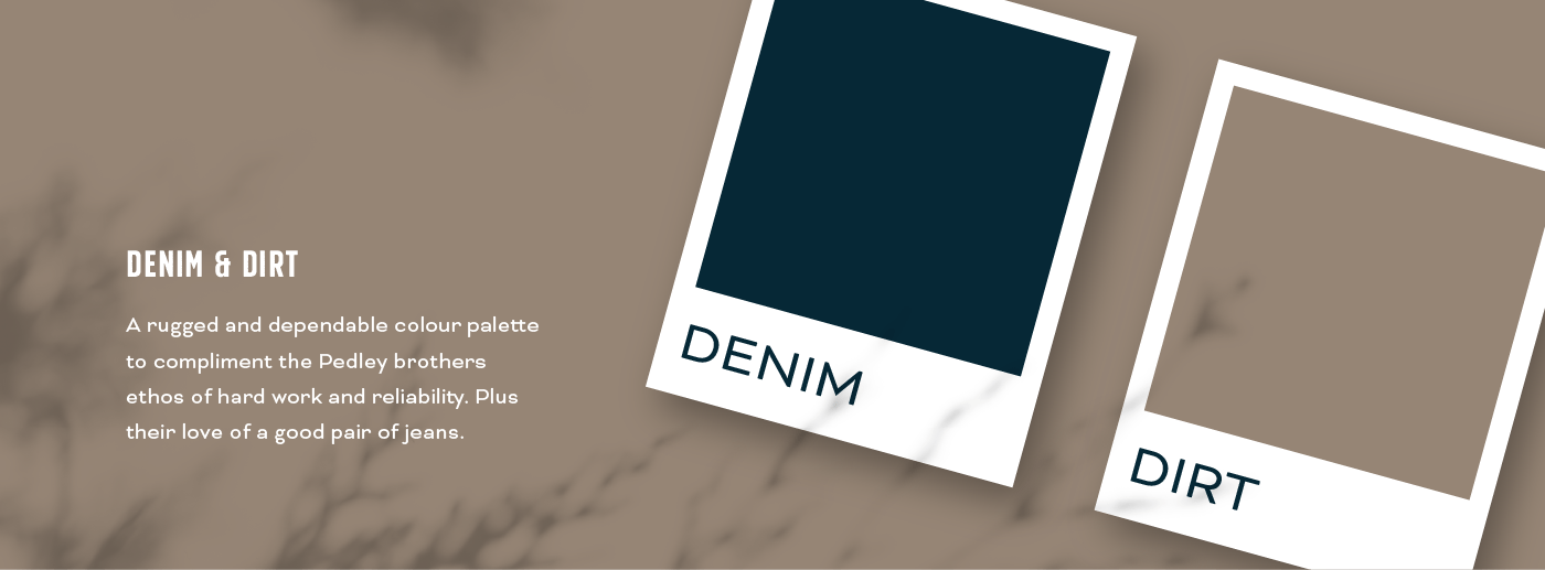
I wanted this to be reflected in the Pedley logo, bringing friendly vintage vibes and a colour palette of denim & dirt.
Brand Identity Brief
Both Matt and Ben wanted a bold, strong look and an identity that stood out amongst others in their field.
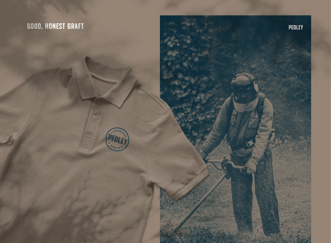
The Pedley brothers are dependable, hard-working and great at what they do. They wanted a brand to encapsulate all of this and their dedication to quality work.
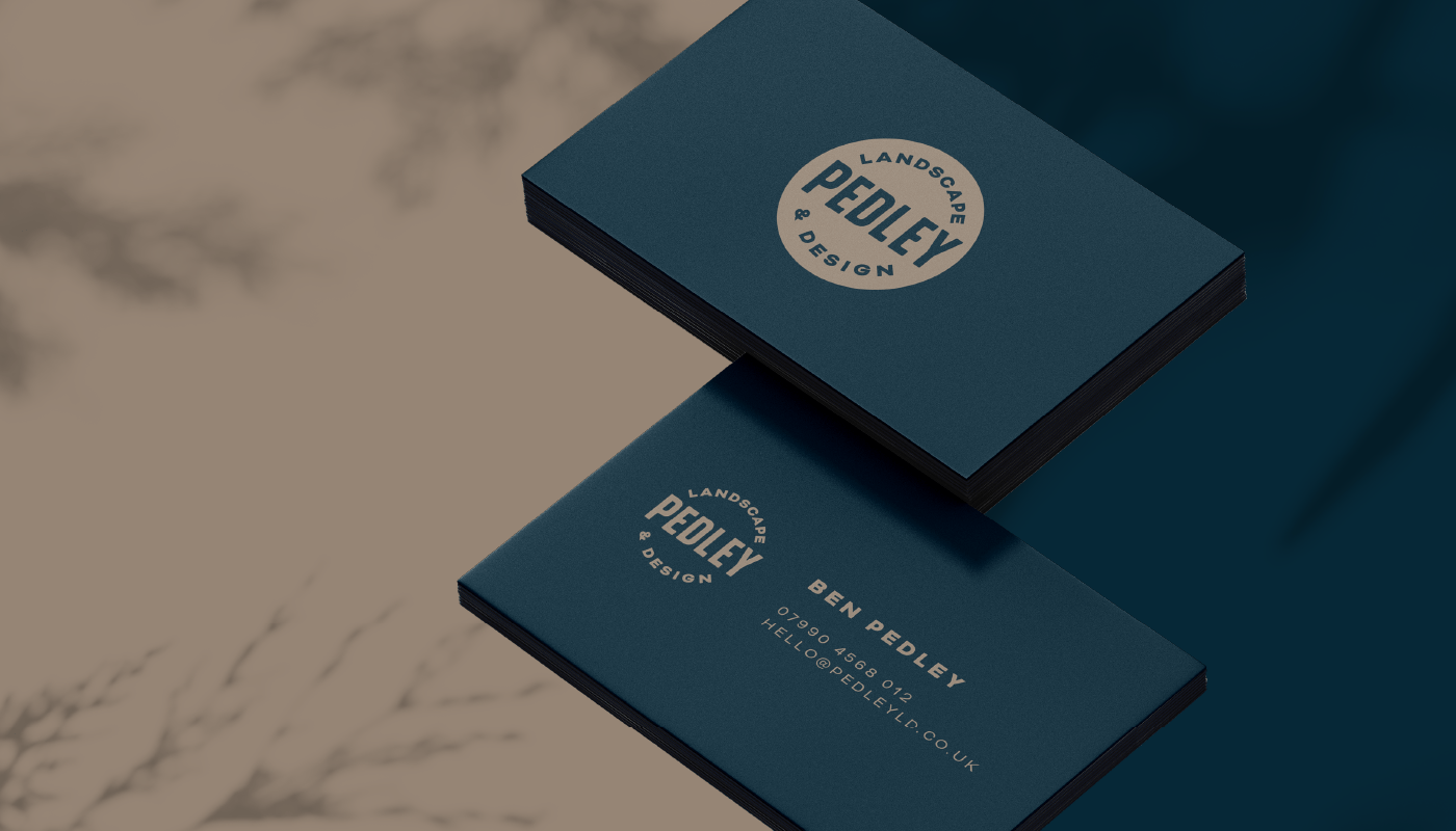
The Pedley Logo Design
Like with any brand development, there are many ideas and sketches leading up to the final designs. From the beginning, I was drawn towards a tall, uppercase typeface. This lent itself well to being encased in a circle, which Ben had mentioned he was really keen on.
To give the Pedley’s some freedom with their branding I made up several versions of their logo. Sometimes a round logo doesn’t fit the place you are using it so it’s good to have options.
This finished logo set is bold, trustworthy and friendly.
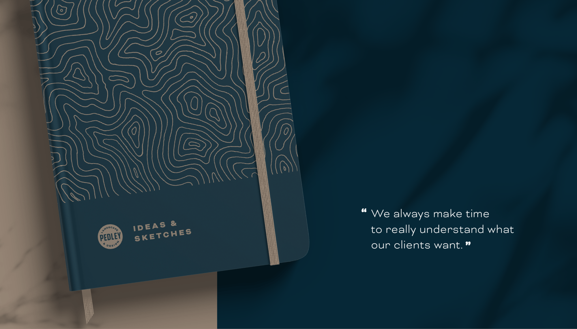
Colour palette
I always work in black and white until I’m ready to look at the colour palette. We all agreed that the colours should be muted and earthy, greens and brighter “garden” colours are overused in the landscaping industry and aren’t really Matt and Ben’s style.
We went with a simple two-colour palette of Denim and Dirt, a colour duo that works beautifully together and brings the branding to life.