Restaurant logo design and identity for Rounders Chicken.
A custom logotype and identity created for a restaurant making fantastically original fried chicken dishes.
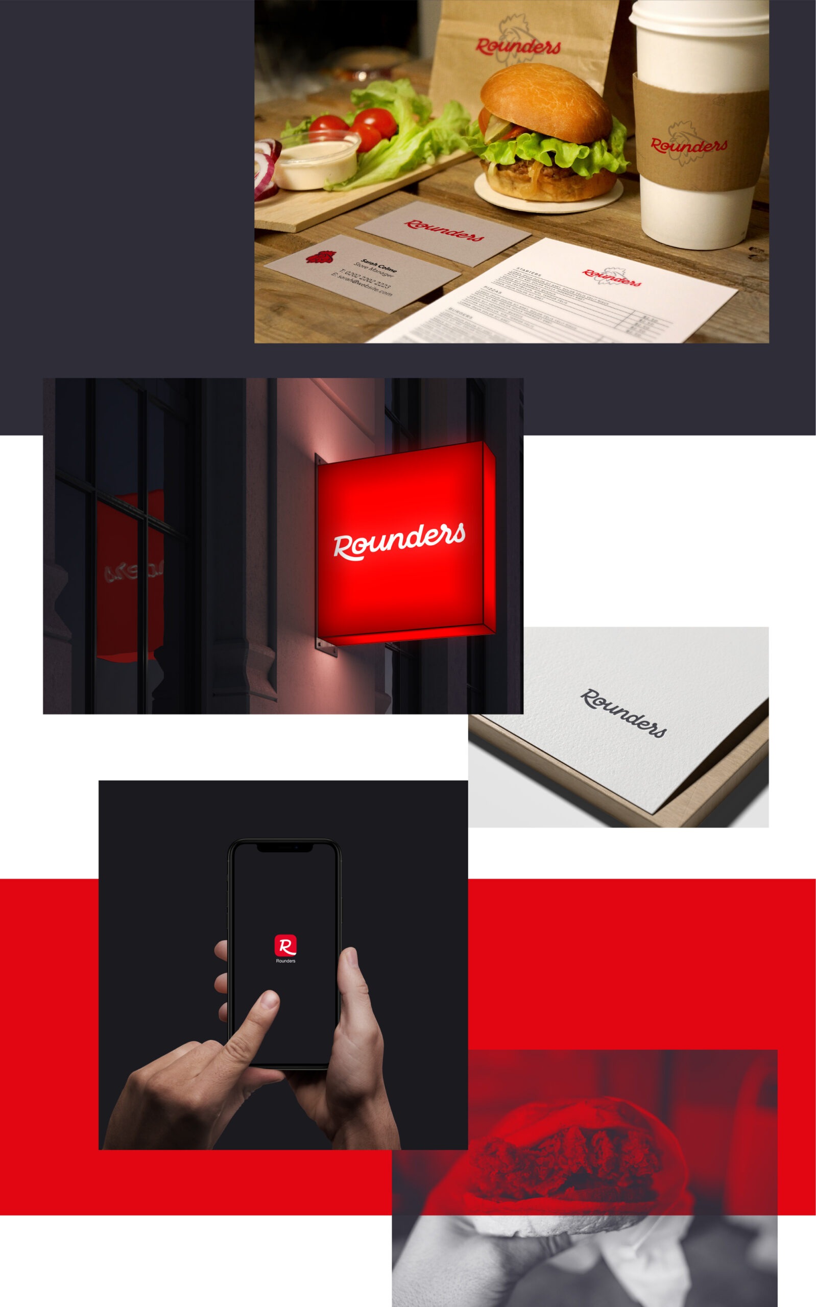
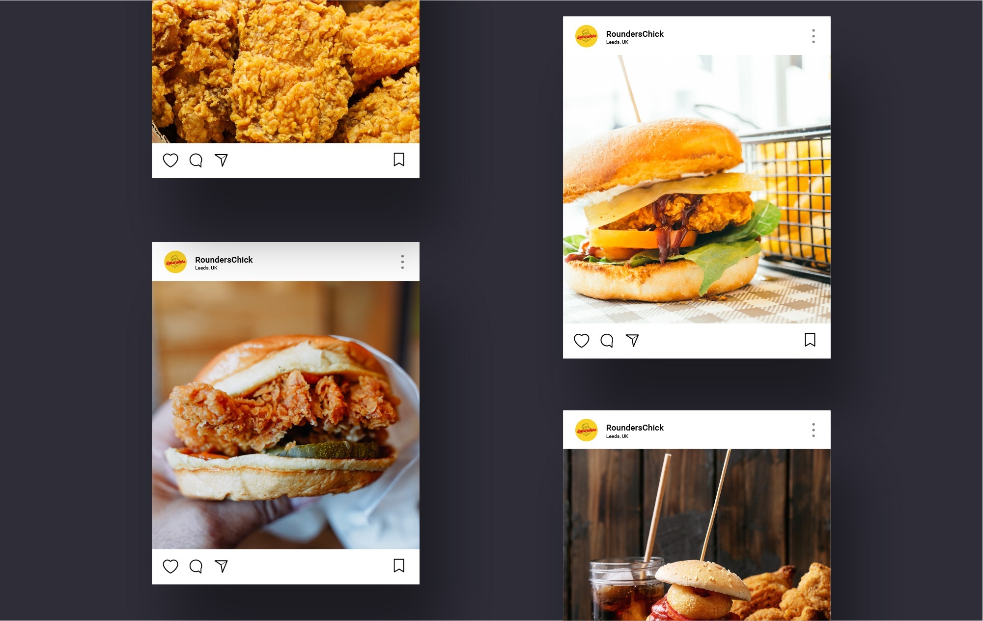
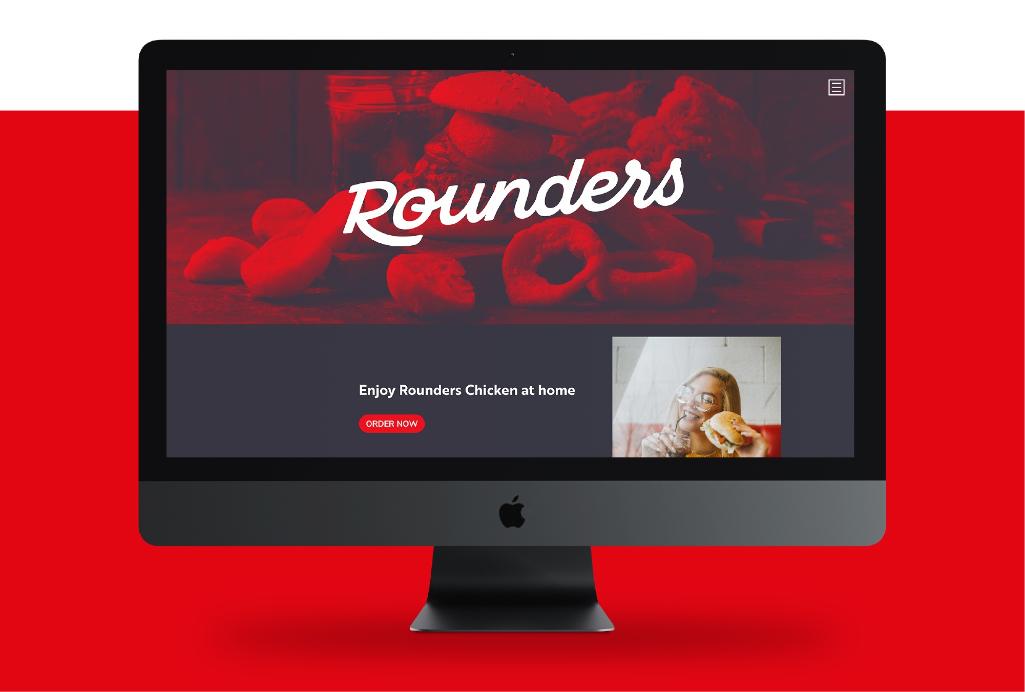
Rounders wanted a brand identity which helped them stand out as the new highstreet fried chicken restaurant with a focus on quality, fresh food all inside a well-styled restaurant.
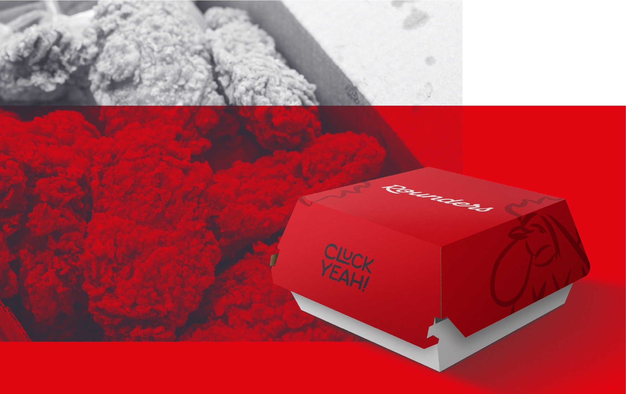
The logo – We wanted to go fully custom on the logotype, the idea of having a logo which is built from scratch always seemed like the only way to go. It reflects the ethos of the restaurant owners and them making a new business with a new outlook on fried chicken. The logotype has a script flow with a solid feel.
The Colour Palette – We’re keeping it rich; Red, deep indigo, stark white and a yellow accent. We wanted to work with the more standard colours for a chicken restaurant but ramp the colours up and give them some pop.