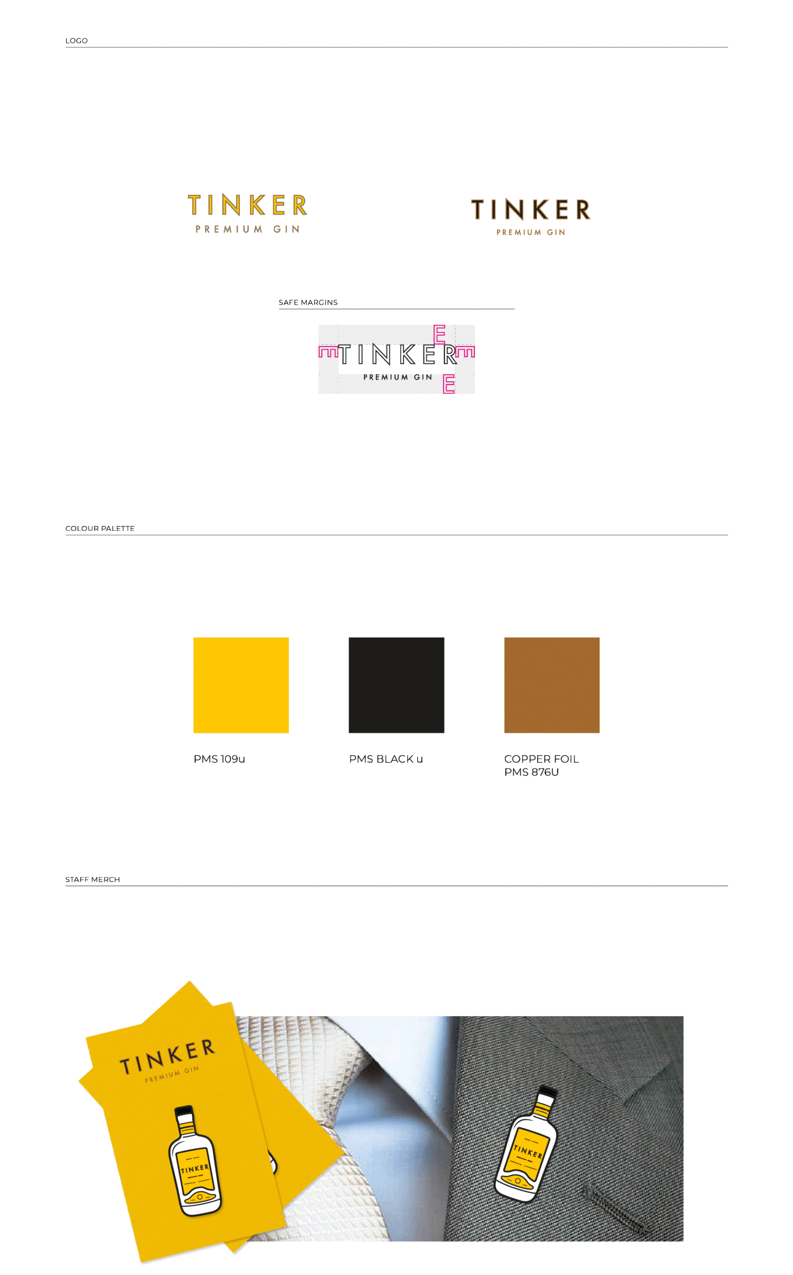
Tinker Gin. Logo Design, brand identity, packaging design, bottle label, art direction.
The design was inspired by the Spanish style gin, Barcelona and Gaudi’s architecture.
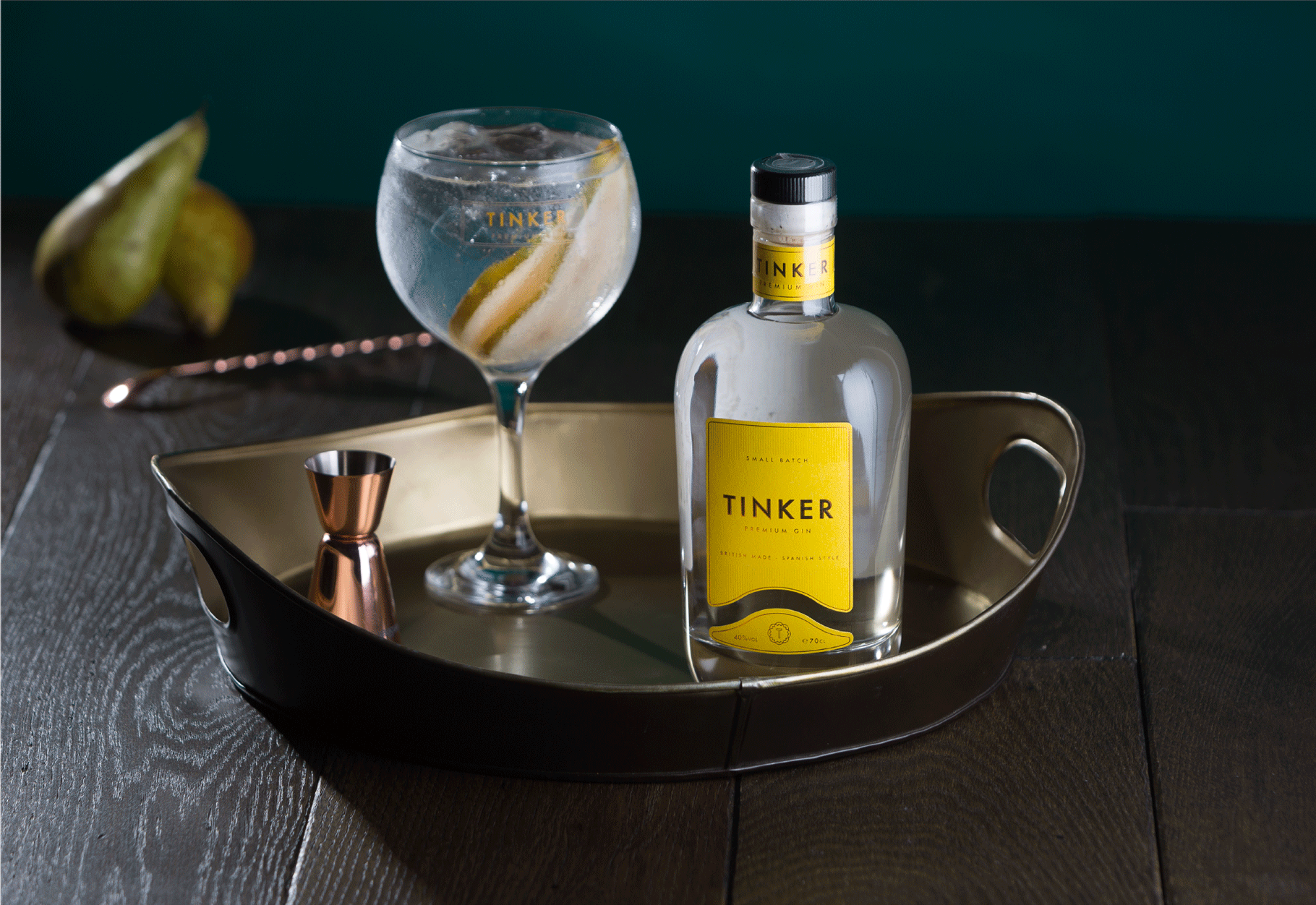
Tinker is a British made, Spanish style gin. Fresh, light juniper plays with well-rounded elderberries and gentle sherbet. It is a thoroughly modern spirit. The taste of Tinker stands out from the crowd of thousands of other gins and the brand identity set out to match this bold gin in addition to standing out on shelves.
A bold colour, a custom shape label plus a bit of foil printing for that luxury feel brings the whole look of Tinker Gin to life. We also wanted to add some tactile elements to the label, we added vertical lines in a raised gloss which help you to recognise a bottle of Tinker from touch alone.
There were several bottle options on the table, the Sumo was the clear winner. This bottle has a sturdy but soft silhouette and the weight gives a feel of superior quality.