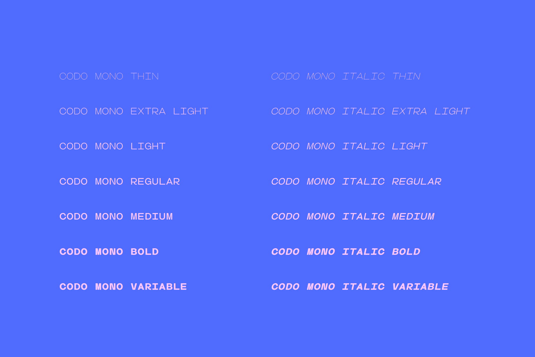
Codo Mono is my first monospace (fixed-width) typeface. This typeface started out as a little challenge for myself having never made a monospace font. I knew there would be a clear upside to this as monospace fonts require no kerning, which is a huge deal! Although, saving on all that kerning means more obstacles elsewhere – the fixed-width.
What is a monospace font?
In a monospace or fixed-width font each character has a set width, Codo Mono has a width of 760, which is actually quite wide for a mono. The standard spacing makes complex text easier to read, which is why monospaced fonts are used in coding software.
Most fonts we use have character widths which are governed by the character design, so the I is naturally slimmer than the M. When designing a monospace font you have to find ways to fill the same while retaining the look of the overall typeface. For Codo you will see that the some letters (m) seem narrower while other letters (lowercase l and i) have to be wider in order to fill out the area and not appear to be too far from other letters.
I’m so pleased with how this typeface has turned out. Designing a fixed-width font has been really interesting, it’s forced me to work a little differently which has led to some good-looking characters.