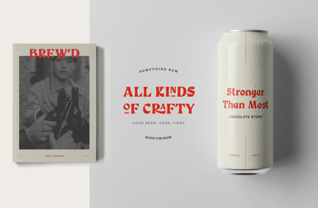
Something New Font
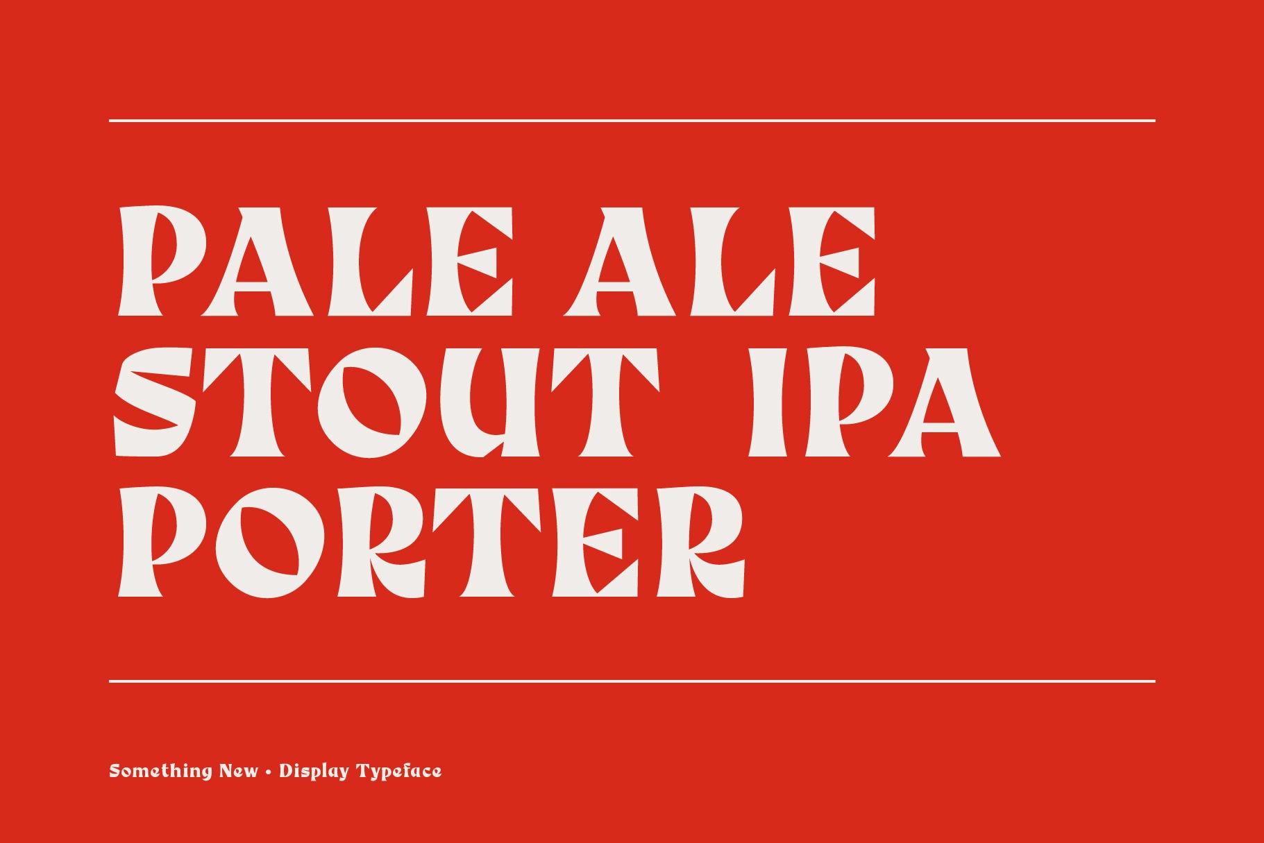
Like most designers, I have a little side project and mine is making fonts.
Font design felt like a natural progression from designing a logotype, it’s essentially just making the rest of the glyphs to create a full typeface.
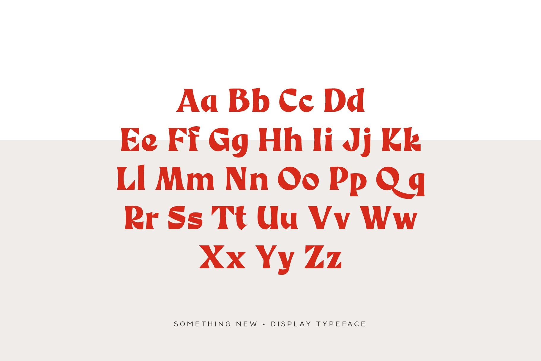
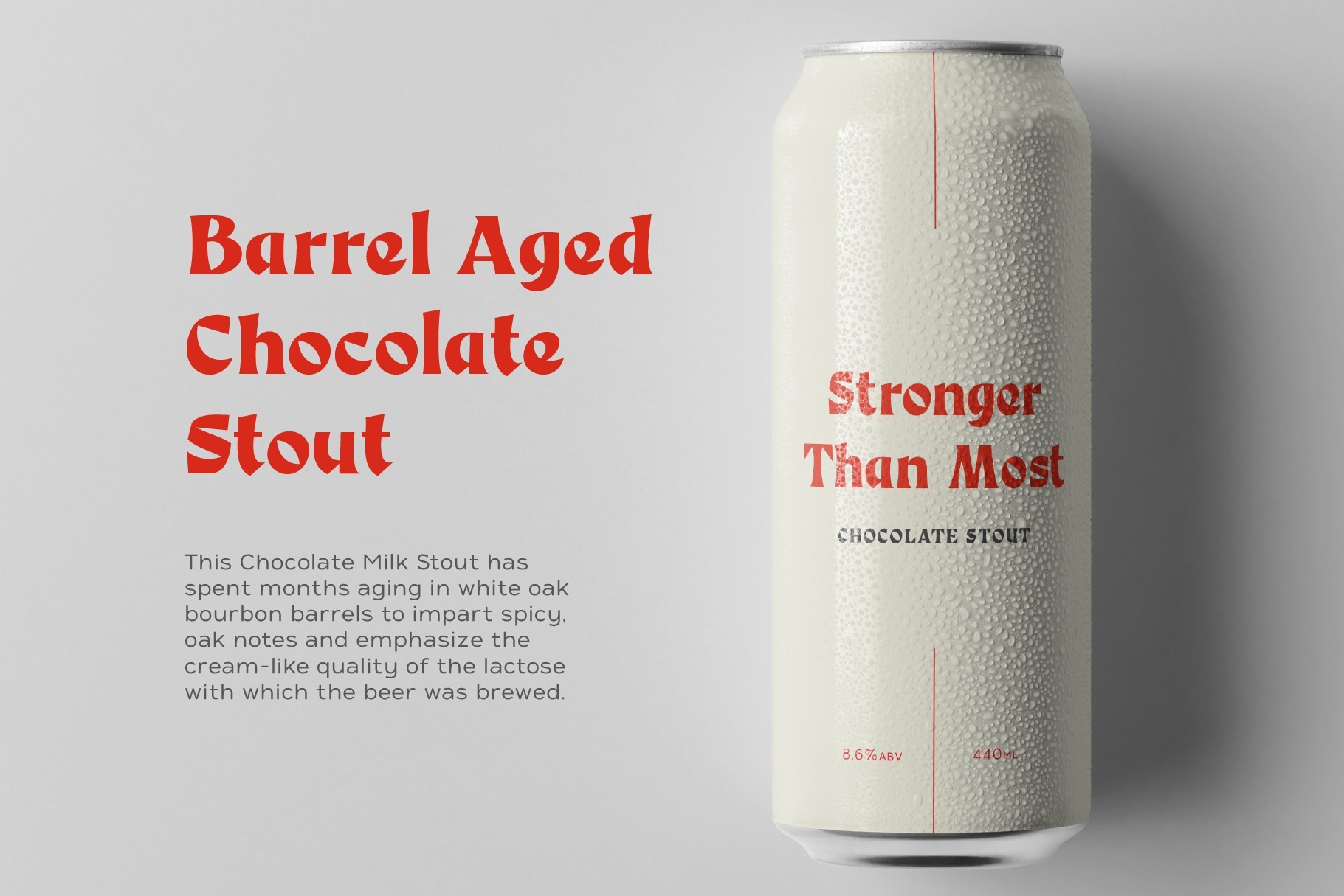
For the Something New Display font, I set out to make a font that is full of character and would be ideal for a craft beer brand.
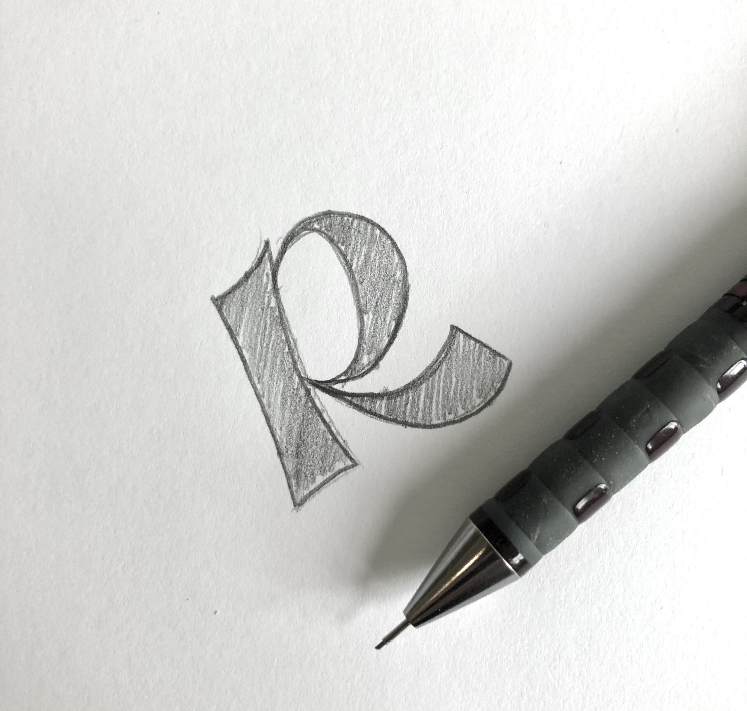
My starting point was the R to get a feel for the stem, bowl and leg. The mix of serif and slight blackletter really piqued my interest and I ran with it. The uppercase glyphs came relatively easy with the exception of the S, they are always a difficult glyph. The S has to have a balance between its mass and negative space while fitting with the rest of the font, finding that balance can take hours – if not days!
To stay within my simple brief of creating a font for a craft beer brand I naturally went down a Bavarian route taking inspiration from Hofmeister Helles, Erdinger and Schofferhofer.
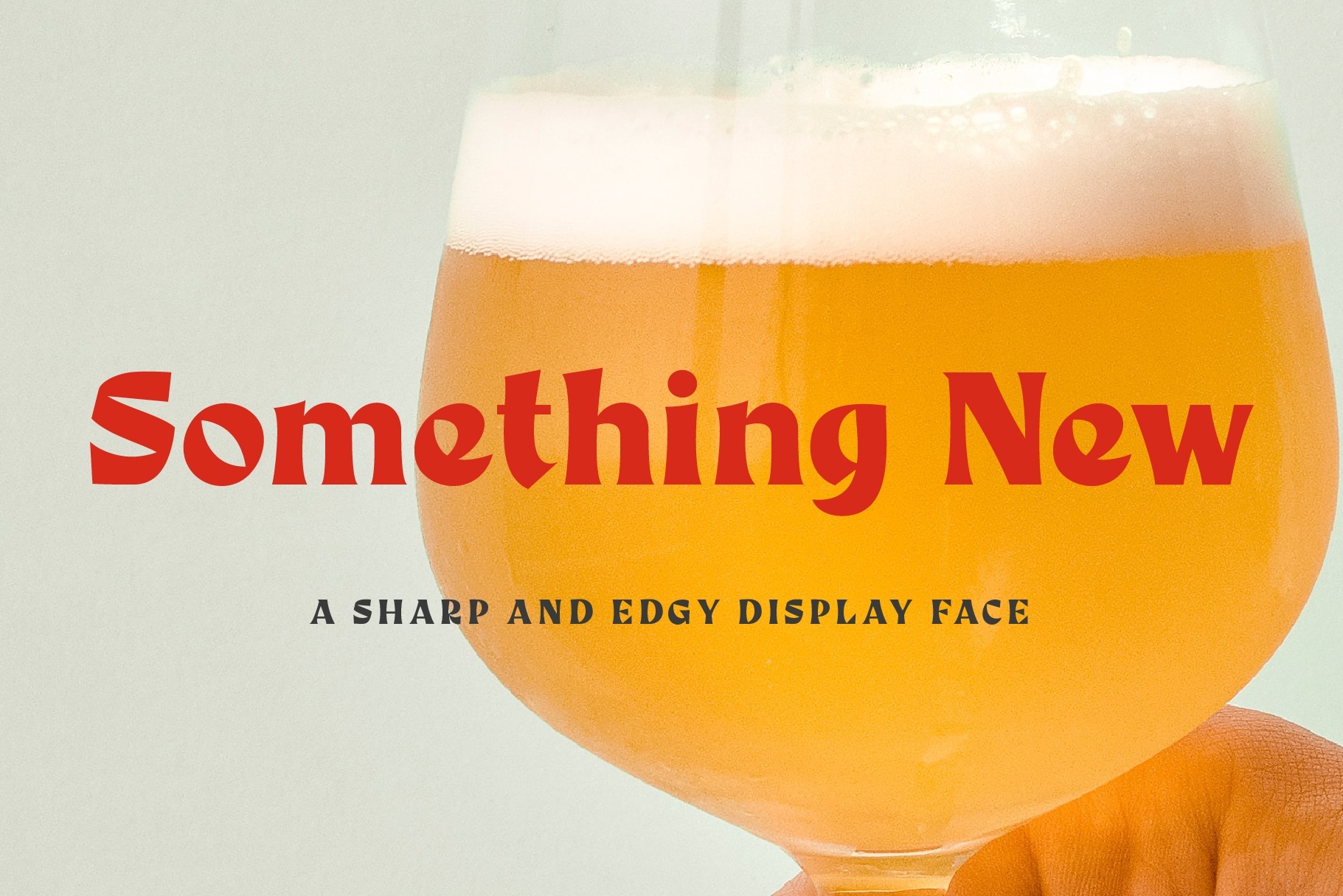
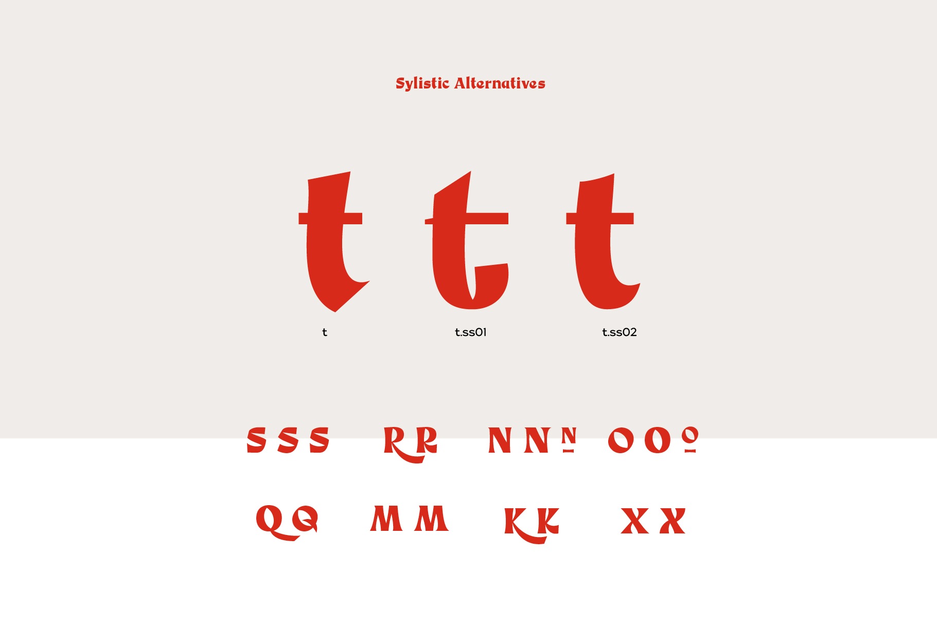
As a designer of logos and logotype, I always want a font with versatility and options. With Something New I build in stylistic alternatives and discretional ligatures to allow the user the ability to create a unique logotype, title or heading by selecting alternative glyphs.
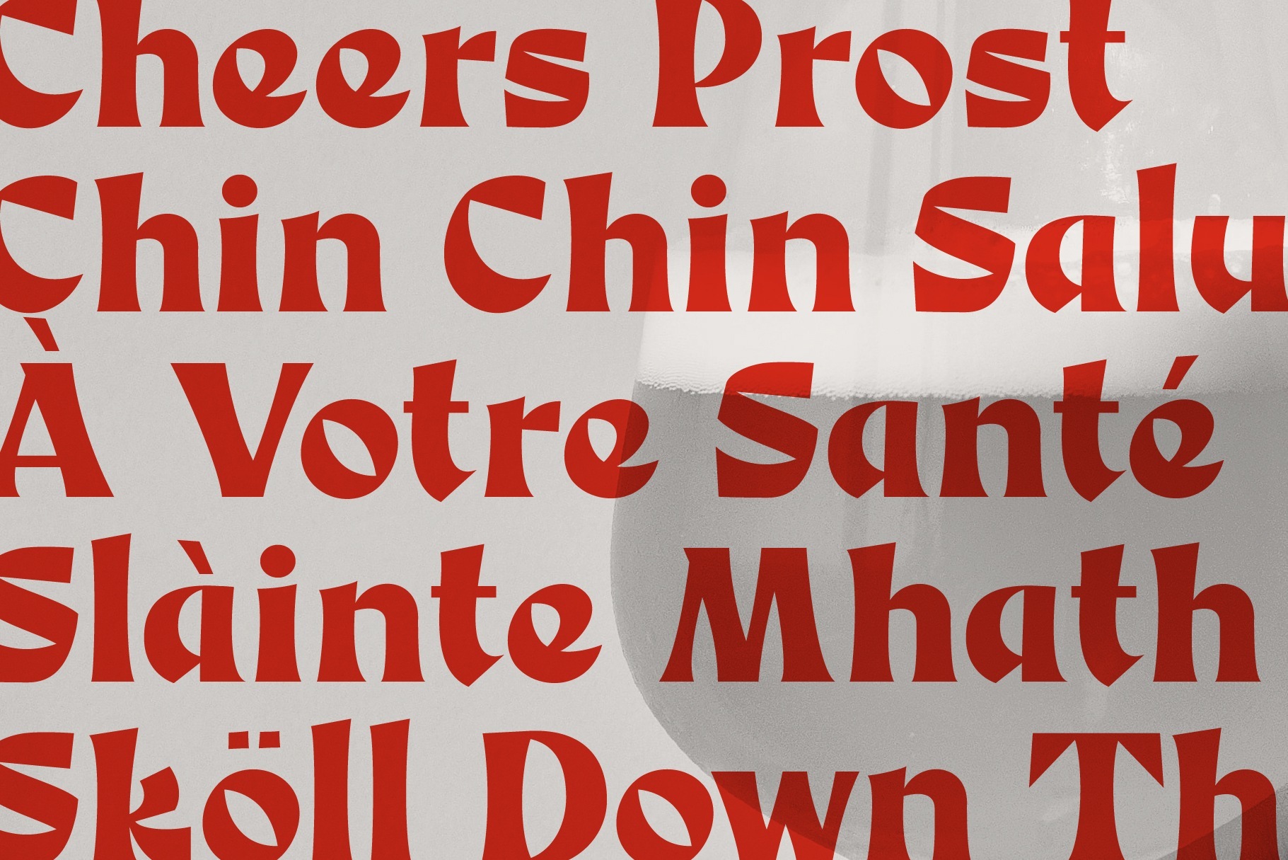
The resulting display font is versatile, strong with a playful side.
Something New Display Font is available form:
Creative Market | Yellow Images | Myfonts
Something New Display Font is available form:
Creative Market
Yellow Images
Myfonts
