Brands reviving logos.
Over the past few years, we have seen a number of brands going through a rebrand but rather than develop a new logo, instead, they revive a logo from their past with tweaks to the design.
All of the brands I’ve seen doing a revival logo are brands that have been around for a long time; Co-op, Renault, Kodak, to name a few. Personally, I like this approach to a redesign, provided they have a strong logo in their evolution, it’s a great way to show you’re a long-standing brand with experience and history.
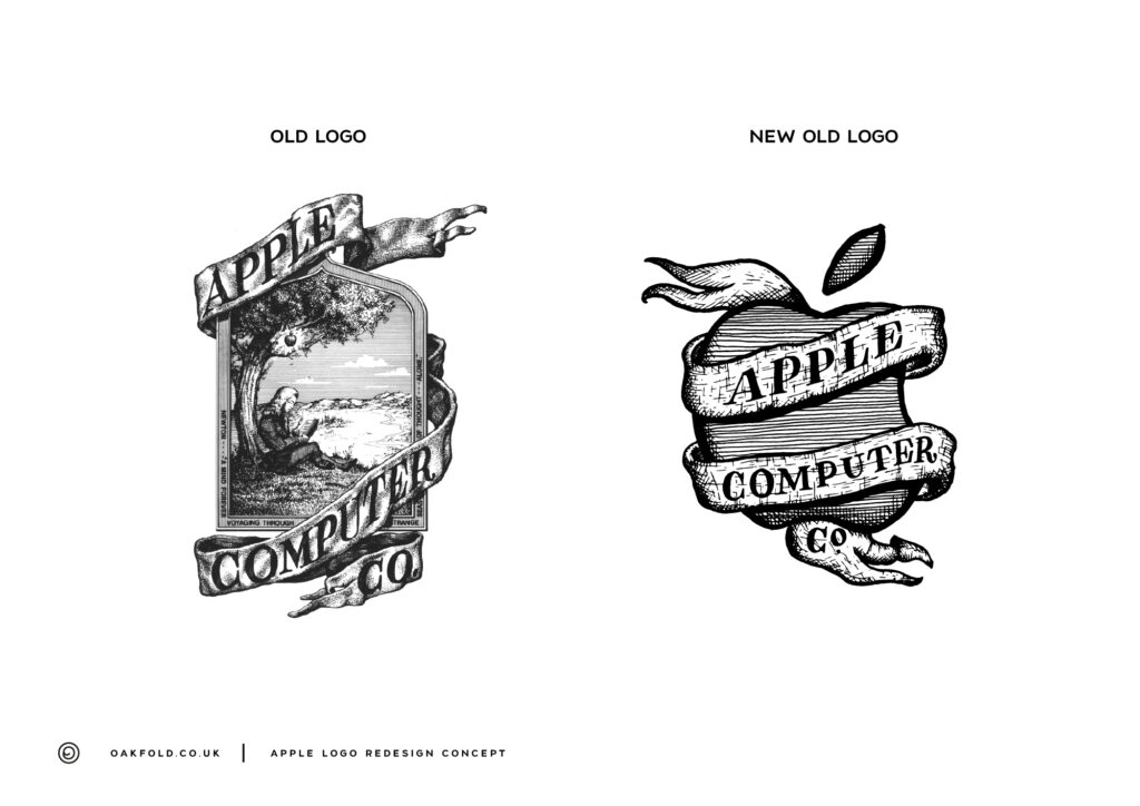
This idea got me thinking about the Apple brand, in particular, the original Apple logo designed by Ronald Wayne, one of the co-founders of Apple. This logo was quickly replaced by the more minimal logo we all know so well today. It was replaced, and rightly so because it was far too intricate making it difficult to reproduce at small scales.
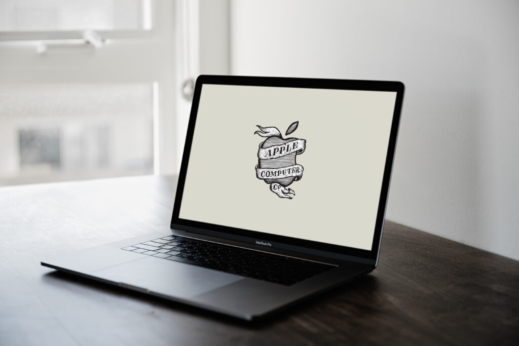
So, my thought was, what if apple revived their original logo, merging it with the more modern version. I decided I needed to see that and set about drawing. Here’s what came from it.

Obviously, sticking to the same style brings up the problem of far too much detail and difficulty in printing but as a nod to the original, I like the result and enjoyed the challenge. One thing I quickly realised was that crosshatching is very difficult!
